Tag Archives: visualisation

Raspberry Pi Carbon Dioxide Monitor

This post shows how to make a Raspberry Pi Carbon Dioxide Monitor using a raspberry pi connected to a USB carbon dioxide monitor. The project is deliberately bare bones and leaves several opportunities for refinement, improvement and general tinkering. What we are aiming to make The following schematic shows what we will be building up… Read More »
Python Dashboard

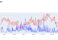
This post shows you how to make a python dashboard using dash. Dash combines the plotly plotting library with the flask server to host the dashboard. Python Dashboard with Dash Dash is a powerful, flexible package and this short guide only scratches its surface. It will show how to make simple python dashboard consisting of… Read More »

Top 10 Data Science Techniques

Data science can mean different things to different people, but we can try to define it by the techniques a data scientist tends to use. A recent online poll gave a top 10 of algorithms and methods used by Data Scientists. This post goes through that top 10 list of data science techniques to flesh… Read More »

Sort Pandas Boxplots

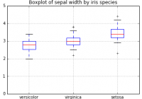
Make pandas boxplots more readable by sorting. Plotting with pandas dataframes usually works well, and makes it easy explore and visualise data. With simple pandas code like this: you can easily make charts like this from your dataframes: Sort Pandas Boxplots The default pandas boxplot easy easy to use, but it can be more clear… Read More »