Data Storytelling
Inspired by the Storytelling With Data book I wanted to try applying some of the techniques to some existing charts and graphs. In all the examples I have been limited in not having access to the original data, so re-plotting hasn’t really been possible. Instead, I have redrawn using Inkscape or Excel and then focused on labels, pre-attentive attributes etc.
Data Storytelling Method
The method Broadly speaking, the data storytelling method from the book is as follows:
- Context – what is the ‘Big Idea’ you are trying to communicate?
- Choose an appropriate display – think about the data and the message
- Eliminate clutter – think about pre-attentive attributes
- Think like a designer – aesthetics and accessibility
- Tell a story – How can you take the audience on a journey
I also considered a few up-front questions to consider when looking at the initial ‘before’ charts:
- Where was my eye drawn?
- Is there any misalignment?
- Are any Gestalt principles jumping out? Proximity, similarity, enclosure, closure, continuity
- Visual order: alignment, use of diagonals, white space, use of colour
- Where are the pre-attentive attributes: Shape, line length/width, size, curvature, added marks, enclosure, hue, intensity, spatial position
Data Storytelling Examples
For each of these examples I try to follow the general ‘Data Storytelling’ approach. Obviously this is somewhat contrived as I don’t really know what the intended message or audience would be, or how the visualisation would be delivered.
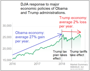
Trump/Obama Economic Policies Reaction
This first example comes from some political analysis of the Trump and Obama presidencies.
 |
|---|
| data storytelling - trump and obama |
Initial thoughts
- Chart doesn't start at zero
- Labels talk about percentages, but axes are numbers
- Multiple colours used
- No obvious focal point - what is the main point this chart is trying make?
- Axes have been made less prominent and are generally uncluttered
- Title not clearly aligned
- Diagonal lines
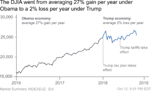
My Attempt
 |
|---|
| data storytelling - trump obama my version |
Summary of changes
- Aligned the title to the left
- Made the title more clearly reflect the Big Idea
- Put all elements to the background by using grey
- Remove colours apart from a blue to emphasise the Trump period
- Reduce size of labels so they are less attention grabbing
- Align labels so the design seems more deliberate
On reflection there were also other things that could have been done
- Re-scale the y-axis to start at zero or show change relative to a baseline
- Add an enclosing box or region to further emphasise the Trump period
Summary thoughts
- Interesting that despite the ‘Big Idea’, once the distractions had been removed the effect was less clear. This is perhaps unsurprising given the source and purpose of the original chart. It’s a good reminder that we need to be careful not to overstretch the data to tell a point, only emphasise what is there.
- I wasn’t really able to do a re-scale of the data so it started at zero. One thing that might have been interesting to do if the raw data was available was to re-plot showing a change from a baseline or change per year. As it is the line graph is rather noisy and in the long-run doesn’t really show much difference in trend between the two presidents.
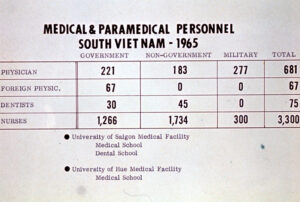
Medical Personnel in South Vietnam
Next is an example of a table taken from a Vietnam war status update.
 |
|---|
| data storytelling - medical personnel |
Initial thoughts
- very noticeable black lines representing rows and columns.
- Center-aligned title
- Title is rather dominant
- No clear purpose or ‘Big Idea’ to highlight.
My Attempt
|  | |:–:| | vietnam personnel - my attempt |
Summary of Changes
- Rather than do anything fancy, just use it as an opportunity to apply some of the general principles of putting non-data to the background and adding a bit of breathing space to the numbers.
- Changed to Arial font so as to be in line with the other graphics attempted in this post. An alternative might have been to move plot it as a bar chart. Using Arial lacks the aesthetic that the original had.
- Use Arial Heavy for the title, but in grey so the title is bold, but sits somewhat in the background
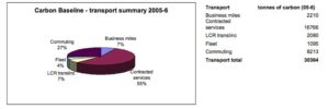
Carbon Baseline
This final example seems to be a carbon review carried out by a business.
 |
|---|
| data storytelling - carbon baseline |
Initial Thoughts
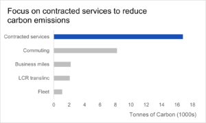
- What’s the big idea? There isn’t much context to this chart, but it seems to be examining carbon generated by different areas. A possible way of expressing this is “Focus on contracted services to make the biggest impact on carbon emissions”.
- Use of a 3d pie chart isn't great, although it does use labels rather than a legend
- Uses a box around the chart
My Attempt
 |
|---|
| data storytelling - carbon baseline - my attempt |
Summary of changes
- In this case I mainly just wanted to get away from using a pie chart.
- Change to horizontal bar chart. Excel recommended this as the category label text is relatively long and there are only a few categories
- Change the title to reflect the Big Idea
- Highlight the main category of interest using blue
Other thoughts:
- Does the book suggest other possible options?
- What about x-axis tick labels?
- What about showing proportions rather than absolute numbers?
Finding Charts for Practice
If you want to practice data storytelling on some existing charts then some possible sources include:
- Wikimedia charts
- flickr
- Just do an image search for 'chart' or 'graph'