Basic Fonts
The designer Massimo Vignelli once said that you only really need around 6 fonts. The logic of that approach is that rather than spending ages trying to find the ‘perfect’ font from all the thousands that are available, you focus on a reduced range of basic fonts. This creative constraint then gives you more space to think about your design as a whole. Or at least that’s the general idea.
Free Alternatives
The fonts suggested by Vignellli are commercially available, and I wanted to look into whether free alternatives were available. Apart from the cost of buying or licensing a font, using widely available fonts makes it much easier to share a document around and still have a it look like you expect at the other end. It is true that these alternatives don’t all look exactly like the original and in fact you will be able to find alternatives closer to the originals out there. The real benefit is the availability of the Microsoft Fonts. I have also tried to include a few variants for your consideration.
| Original Vignelli Font | Microsoft Fonts | Also consider |
Helvetica 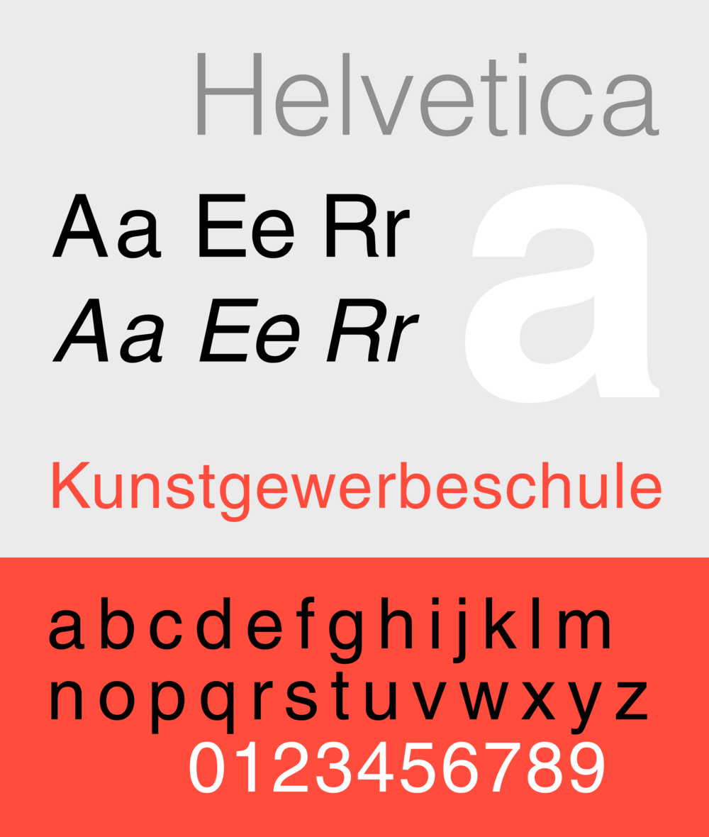 | Arial - see the differences | IBM Plex, Open Sans, Roboto, See also https://fontsplugin.com/google-fonts-helvetica-neue/ |
Bodoni 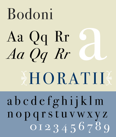 | Available as Bodoni MT | |
Garamond 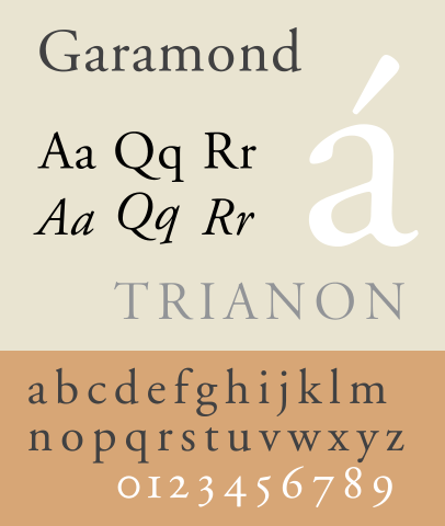 | Available as Garamond | |
Futura 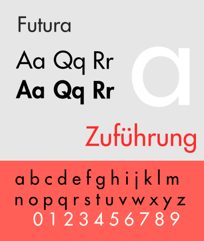 | Century Gothic - see the differences | Spartan, Jost, Nunito Sans, Hind . See also https://fontsplugin.com/google-fonts-futura/ |
Times New Roman 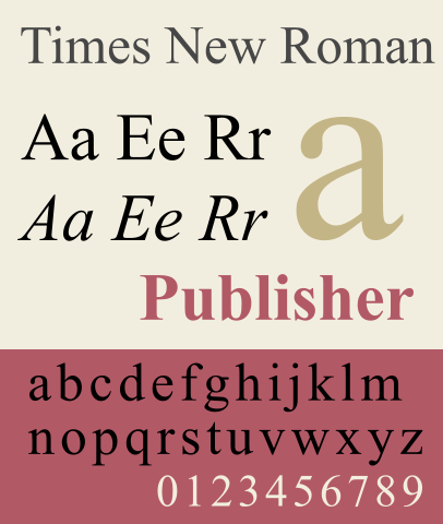 | Available as Times New Roman | |
Century Expanded (Note the example below is actually of Century Schoolbook - the differences are small) 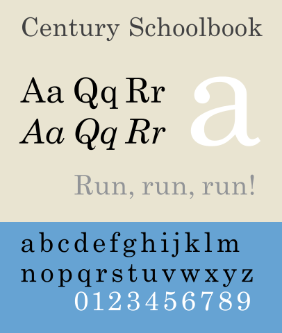 | Available as Century Schoolbook - see the differences. |