Python Timeline Plot
Timelines are a great way to present events in a chronological order. Timelines can be elaborate, bespoke graphics, but I wanted to see how to make a python timeline plot rather than making one by hand. The key benefit of creating the timeline in python rather than creating it by hand in a graphics tool means that entries can easily be added and extended without needing to redraw the timeline entirely. In this post I will show how to make a simple Python timeline plot with three different popular plotting libraries:
- Matplotlib - one of the most common and widely available plotting libraries. Not always the easiest to use, but it's availability makes it worth knowing.
- Altair - a relative newcomer, the Altair library uses a declarative approach and a visual grammar to help make beautiful, interactive plots.
- Plotly - a popular, mature and well-supported library for making interactive, publication-quality graphs.
Read more about different plotting libraries for Python
Python Timeline Plot Comparison
The examples below give a few options for how to make a python timeline plot. They won’t be perfect examples, but hopefully give enough of a starting point for using each of the different libraries. There are clearly differences in implementation and appearance, so exactly which approach is best will depend on your circumstances. For availability I would recommend matplotlib. For appearance and ease of use I would recommend plotly.
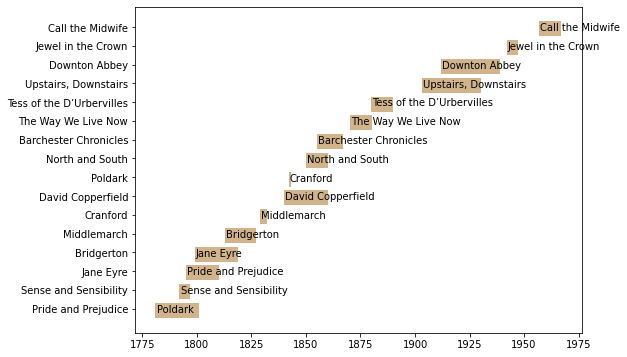
Matplotlib
Matplotlib is older than the other two libraries included in this blog post and also has less in the way of assistance for making particular charts. The absence of a simple template to start from means that the timeline graph must be assembled from multiple different concepts. This makes it useful for understanding exactly what is going on, but can make progress slower. The main benefit of matplotlib is its wide availability, so it is a useful library to know even just as a fall-back option.
 |
|---|
| python timeline plot - matplotlib example |
1
2
3
4
5
6
7
8
9
10
11
12
13
14
15
16
17
18
19
20
21
22
23
24
25
26
27
28
29
30
31
32
33
34
35
36
37
38
39
40
41
42
43
44
45
46
47
# Matplotlib
# https://www.geeksforgeeks.org/python-basic-gantt-chart-using-matplotlib/
# https://matplotlib.org/devdocs/api/_as_gen/matplotlib.pyplot.broken_barh.html
import matplotlib.pyplot as plt
import numpy as np
source = pd.DataFrame([
    {"drama": "Pride and Prejudice", "start": '1795-01-01', "end": '1810-01-01'},
    {"drama": "Sense and Sensibility","start": '1792-01-01', "end": '1797-01-01'},
    {"drama": "Jane Eyre","start": '1799-01-01', "end": '1819-01-01'},
    {"drama": "Bridgerton","start": '1813-01-01', "end": '1827-01-01'},
    {"drama": "Middlemarch","start": '1829-01-01', "end": '1832-01-01'},
    {"drama": "Cranford","start": '1842-01-01', "end": '1843-01-01'},
    {"drama": "David Copperfield","start": '1840-01-01', "end": '1860-01-01'},
    {"drama": "Poldark","start": '1781-01-01', "end": '1801-01-01'},
    {"drama": "North and South", "start": '1850-01-01', "end": '1860-01-01'},
    {"drama": "Barchester Chronicles", "start": '1855-01-01', "end": '1867-02-01'},
    {"drama": "The Way We Live Now", "start": '1870-01-01', "end": '1880-02-01'},
    {"drama": "Tess of the D’Urbervilles", "start": '1880-01-01', "end": '1890-02-01'},
    {"drama": "Upstairs, Downstairs", "start": '1903-01-01', "end": '1930-02-01'},
    {"drama": "Downton Abbey", "start": '1912-01-01', "end": '1939-02-01'},
    {"drama": "Jewel in the Crown", "start": '1942-01-01', "end": '1947-02-01'},
    {"drama": "Call the Midwife", "start": '1957-01-01', "end": '1967-02-01'},
])
source['start'] = pd.to_datetime(source['start'])
source['end'] = pd.to_datetime(source['end'])
source['diff'] = source['end'] - source['start']
# Declaring a figure "gnt"
fig, gnt = plt.subplots(figsize=(8,6))
# Need to fix hidden tick labels
# https://stackoverflow.com/questions/43673659/matplotlib-not-showing-first-label-on-x-axis-for-the-bar-plot
y_tick_labels = source.drama.values
y_pos = np.arange(len(y_tick_labels))
gnt.set_yticks(y_pos)
gnt.set_yticklabels(y_tick_labels)
# https://sparkbyexamples.com/python/iterate-over-rows-in-pandas-dataframe/
# https://www.tutorialspoint.com/plotting-dates-on-the-x-axis-with-python-s-matplotlib
# https://matplotlib.org/stable/gallery/color/named_colors.html
# https://pandas.pydata.org/pandas-docs/stable/reference/api/pandas.DataFrame.sort_values.html
# https://www.geeksforgeeks.org/how-to-annotate-matplotlib-scatter-plots
for index, row in source.sort_values(by='start').reset_index().iterrows():
    start_year = int(row.start.strftime("%Y"))
    duration = row['diff'].days/365
    gnt.broken_barh([(start_year, duration)],
                    (index-0.5,0.8),
                    facecolors =('tan'),
                   label=row.drama)
    gnt.text(start_year+0.5, index-0.2, row.drama)
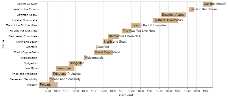
Altair
Altair is a more modern library than matplotlib, and does provide some more advanced templates which make creating the timeline plot easier.
 |
|---|
| python timeline plot - altair example |
1
2
3
4
5
6
7
8
9
10
11
12
13
14
15
16
17
18
19
20
21
22
23
24
25
26
27
28
29
30
31
32
33
34
35
36
37
38
# Altair
# https://altair-viz.github.io/gallery/gantt_chart.html
# https://www.statology.org/convert-columns-to-datetime-pandas/
import altair as alt
import pandas as pd
source = pd.DataFrame([
    {"drama": "Pride and Prejudice", "start": '1795-01-01', "end": '1810-01-01'},
    {"drama": "Sense and Sensibility","start": '1792-01-01', "end": '1797-01-01'},
    {"drama": "Jane Eyre","start": '1799-01-01', "end": '1819-01-01'},
    {"drama": "Bridgerton","start": '1813-01-01', "end": '1827-01-01'},
    {"drama": "Middlemarch","start": '1829-01-01', "end": '1832-01-01'},
    {"drama": "Cranford","start": '1842-01-01', "end": '1843-01-01'},
    {"drama": "David Copperfield","start": '1840-01-01', "end": '1860-01-01'},
    {"drama": "Poldark","start": '1781-01-01', "end": '1801-01-01'},
    {"drama": "North and South", "start": '1850-01-01', "end": '1860-01-01'},
    {"drama": "Barchester Chronicles", "start": '1855-01-01', "end": '1867-02-01'},
    {"drama": "The Way We Live Now", "start": '1870-01-01', "end": '1880-02-01'},
    {"drama": "Tess of the D’Urbervilles", "start": '1880-01-01', "end": '1890-02-01'},
    {"drama": "Upstairs, Downstairs", "start": '1903-01-01', "end": '1930-02-01'},
    {"drama": "Downton Abbey", "start": '1912-01-01', "end": '1939-02-01'},
    {"drama": "Jewel in the Crown", "start": '1942-01-01', "end": '1947-02-01'},
    {"drama": "Call the Midwife", "start": '1957-01-01', "end": '1967-02-01'},
])
source['start'] = pd.to_datetime(source['start'])
source['end'] = pd.to_datetime(source['end'])
bars = alt.Chart(source).mark_bar(color='tan').encode(
    x='start',
    x2='end',
    y=alt.Y('drama', sort='-x')
)
text = bars.mark_text(
    align='left',
    baseline='middle',
    dx=3  # Nudges text to right so it doesn't appear on top of the bar
).encode(
    text='drama'
)
(bars + text).properties(height=300, width=600)
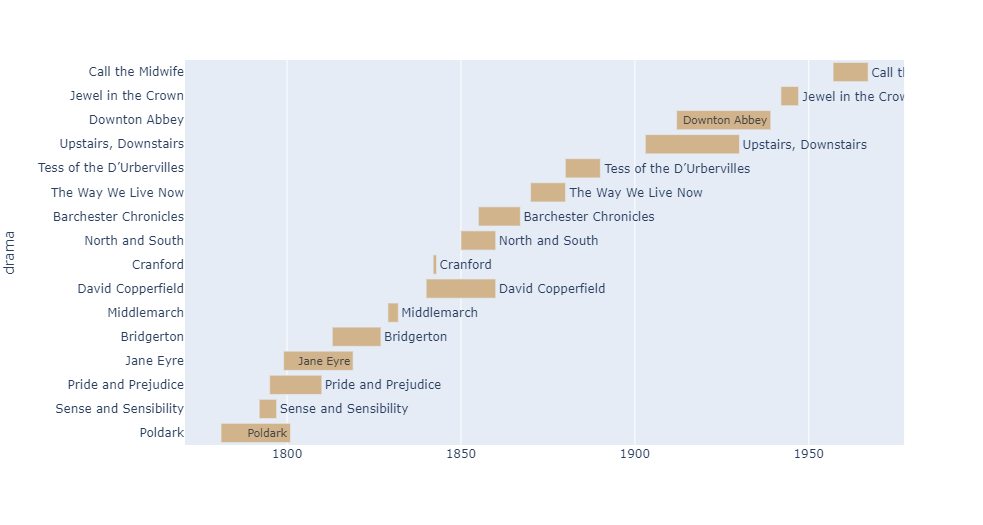
Plotly
The plotly library actually provides a module for creating timelines, which obviously makes it much easier to deal with than the other examples in this post. There are still some areas to watch out for or personalise, but generally speaking plotly makes it easy to go from no-plot, to plot.
 |
|---|
| python timeline plot - plotly example |
1
2
3
4
5
6
7
8
9
10
11
12
13
14
15
16
17
18
19
20
21
22
23
24
25
26
27
28
29
30
31
32
33
# Plotly
# https://plotly.com/python/gantt/
# https://plotly.com/python-api-reference/generated/plotly.express.timeline.html
# https://plotly.com/python/discrete-color/#color-sequences-in-plotly-express
import plotly.express as px
import pandas as pd
source = pd.DataFrame([
    {"drama": "Pride and Prejudice", "start": '1795-01-01', "end": '1810-01-01'},
    {"drama": "Sense and Sensibility","start": '1792-01-01', "end": '1797-01-01'},
    {"drama": "Jane Eyre","start": '1799-01-01', "end": '1819-01-01'},
    {"drama": "Bridgerton","start": '1813-01-01', "end": '1827-01-01'},
    {"drama": "Middlemarch","start": '1829-01-01', "end": '1832-01-01'},
    {"drama": "Cranford","start": '1842-01-01', "end": '1843-01-01'},
    {"drama": "David Copperfield","start": '1840-01-01', "end": '1860-01-01'},
    {"drama": "Poldark","start": '1781-01-01', "end": '1801-01-01'},
    {"drama": "North and South", "start": '1850-01-01', "end": '1860-01-01'},
    {"drama": "Barchester Chronicles", "start": '1855-01-01', "end": '1867-02-01'},
    {"drama": "The Way We Live Now", "start": '1870-01-01', "end": '1880-02-01'},
    {"drama": "Tess of the D’Urbervilles", "start": '1880-01-01', "end": '1890-02-01'},
    {"drama": "Upstairs, Downstairs", "start": '1903-01-01', "end": '1930-02-01'},
    {"drama": "Downton Abbey", "start": '1912-01-01', "end": '1939-02-01'},
    {"drama": "Jewel in the Crown", "start": '1942-01-01', "end": '1947-02-01'},
    {"drama": "Call the Midwife", "start": '1957-01-01', "end": '1967-02-01'},
])
source['start'] = pd.to_datetime(source['start'])
source['end'] = pd.to_datetime(source['end'])
fig = px.timeline(source.sort_values('start'),
                  x_start="start",
                  x_end="end",
                  y="drama",
                  text="drama",
                  color_discrete_sequence=["tan"])
fig.show()