Live Transport Data Maps
Transport is one area where the wide availability of data has made a big difference in recent years. Google mapsis probably the most obvious example, but there are also some other cool projects out there. Here I’ve picked out some cool map and visualisation projects that use live transport data to visualise transport systems around the world. As well as being cool visualisations, these projects can be inspirations for your own projects, or even just useful for finding out when to get a train.
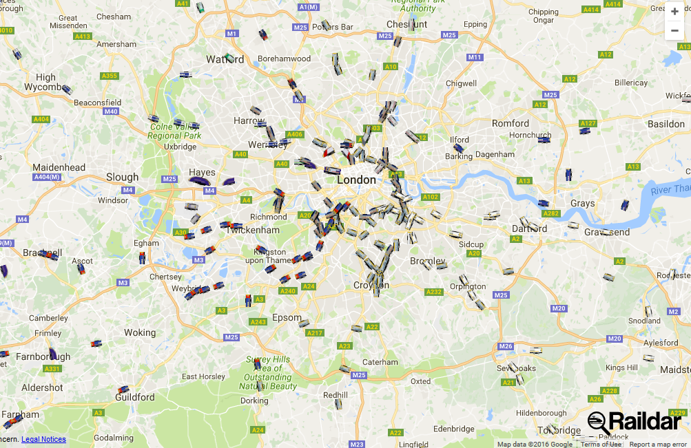
Raildar
Raildar shows you live transport data of trains around the UK. You can view the live data of trains all around the country (and even see which train operating country is running the different services.)
 |
|---|
| raildar - cool transport data |
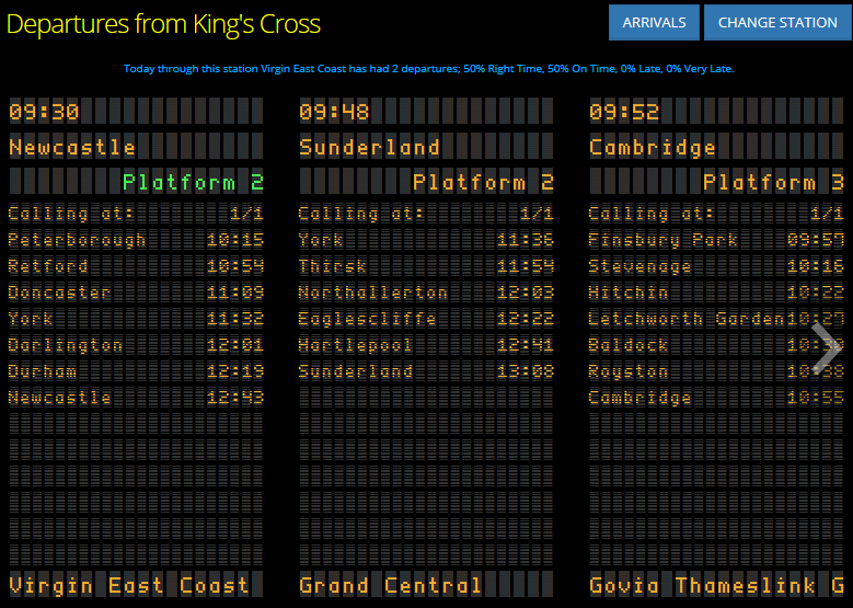
Raildar is useful as well as looking cool - it uses its real time, live transport data to provide updates to arrivals and departure boards for stations around the country.
 |
|---|
| raildar - live transport data - departure board |
London Underground
Raildar doesn’t cover underground trains operated by Transport For London - that’s where this site comes in. Originally created as part of Science Hackday, the live map of the tube lets you follow the progress of trains across the Transport for London network.
 |
|---|
| cool transport data - Londong Underground |
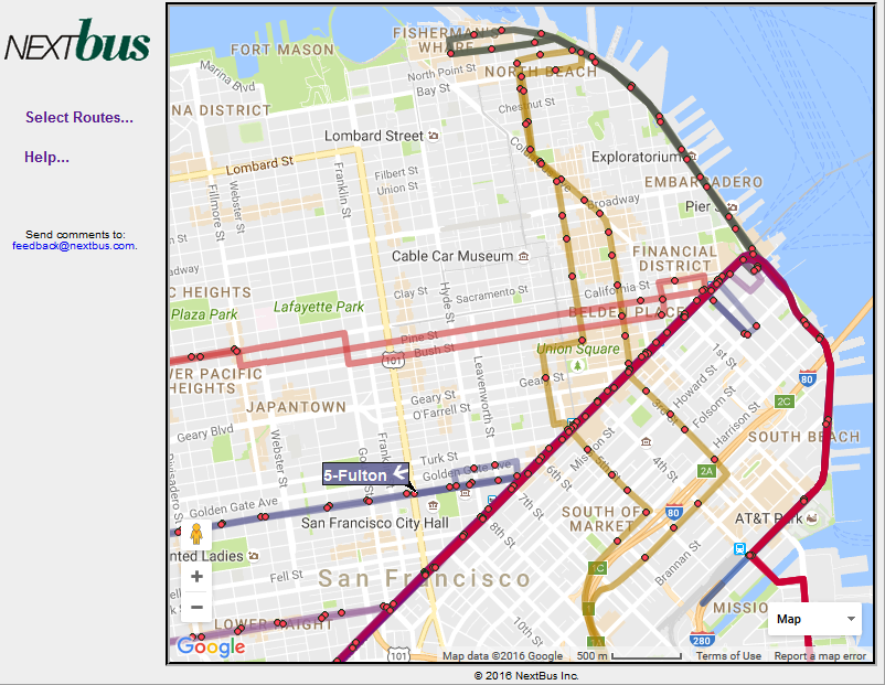
San Francisco Street Cars
Staying with city mass transit systems, this live transport data map from NextBus displays the locations and progress of San Francisco street cars. It doesnt’ feel quite as polished as some of the other maps available, but it is a nice example of what you can do when you have access to the right data.
 |
|---|
| cool transport data - san francisco |
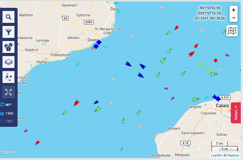
Marine Traffic
It’s not just trains that can be tracked in real time. MarineTraffic.com shows the movement of around 150,000 sea-going vessels of various types. You can search the underlying data by vessel name, type, region or port. It’s incredibly interesting to explore the world’s ocean trade routes this way.
 |
|---|
| live transport data - marine traffic |
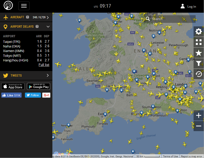
Flight Radar
FlightRadar24.com was probably the first tool I found to visualise live transport data online. The site shows you the locations of flights around the world and, apart from being very cool to look at, this can also be useful if you want to track the progress of a friend’s journey, or monitor the effects of weather or volcanoes on aeroplane flight paths.
 |
|---|
| Cool Transport Data - FlightRadar |