How to create Origin Subplots
How to Create Subplots in Origin
Subplots can be a useful way to display data clearly. In this post I show you how to use Origin to plot data as subplots. This guide was made using Origin 8, but I imagine something similar should work with other origin versions.
Plot Your Multiple Data Sets
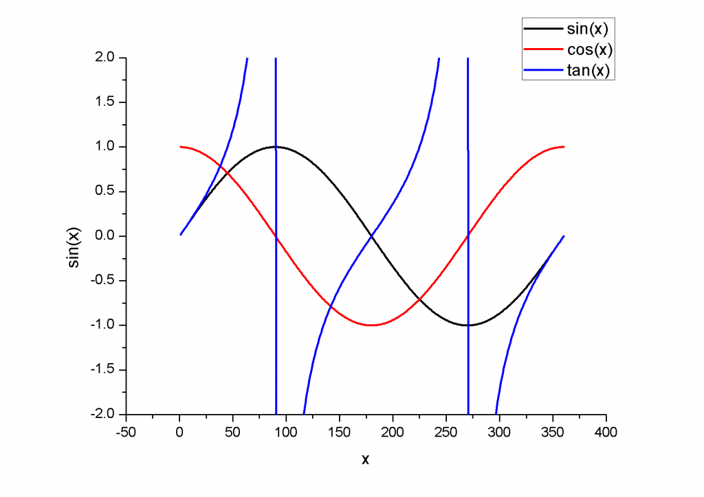
We begin by plotting our multiple data sets on a single axis. In this example I’m simply plotting the sine, cosine and tangent of an angle.
 |
|---|
| origin subplots - same axis |
As you can see, it’s a bit messy. Definitely a candidate for converting into subplots.
Extract to Layers
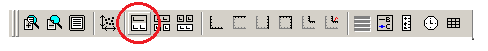
With your data displayed on the same plot, select this graph and find the “Extract to Layers” button on your toolbar:
 |
|---|
| origin subplots - extract to layers |
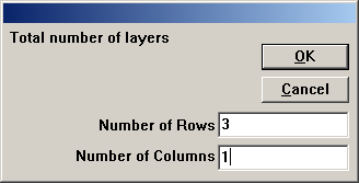
this will bring up a dialogue asking you to select the number of rows and columns you would like to generate. For this example we will use 3 rows and 2 column.
 |
|---|
| origin subplots - grid setup |
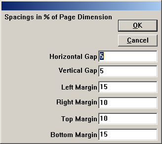
Click ‘OK’ to bring up a further dialogue to set various margins and and spacings. For now we can just stick with the defaults.
 |
|---|
| origin subplots - margins |
Click ‘OK’ to generate your three subplots:
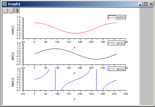 |
|---|
| origin subplots - generate subplots |
If you like, you can leave things here: this is definitely much clearer than plotting all three curves on the same axes.
Tidy Up Your Subplots
The default subplot output doesn’t look too bad, but I prefered to make some adjustments:
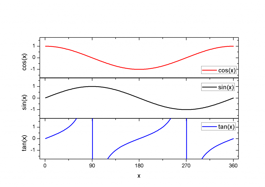 |
|---|
| origin subplots - final graph |