ggplot for Python
ggplot for Python
The ggplot library for python unlocks much of the philosophy and pretty graphics of ggplot2 for R. Try it out and make your data look nicer.
Bringing ggplot to Python
One of the ‘killer apps’ of the statistics package R is ggplot2, a plotting library based on the book The Grammar of Graphics, that takes the hassle and fiddle out of creating nice looking graphs and graphics.
Although there are powerful plotting libraries for python (matplotlib being the main one) , they don’t have the same approach and pretty output as ggplot2 for R. Thankfully a version of ggplot for python is in development so you can access the power and flexibility of ggplot2 in your python data analysis.
Using ggplot To Improve Plotting
There are plenty of places you can see a complete comparison of the R vs python ggplot implementations, so I’ll just give you a quick flavour of what to expect. I recently plotted data about pizza prices. Using straight matplotlib, the output graph looks like this:
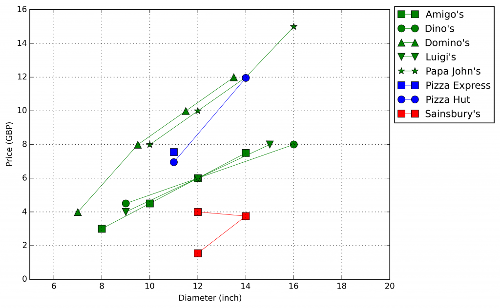 |
|---|
| pizza price comparison - price vs diameter |
Which certainly does the job, but I’m not sure I’d go as far to say that it was pretty. To try and improve things, let’s use ggplot for python:
1
2
ggplot(prices, aes(x='Diameter', y='Price',color="establishment_name")) +\
    geom_line() + geom_point()
which creates the much nicer output:
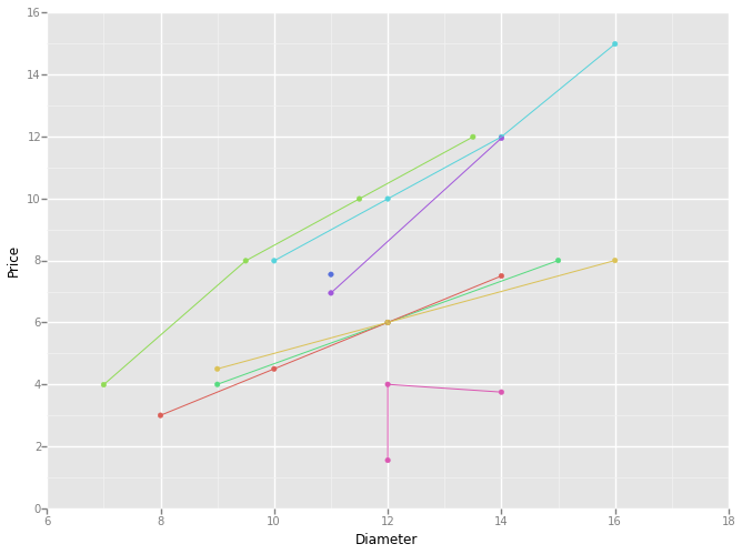 |
|---|
| ggplot for python - ggplot prices |
Clearly a much more artistic representation! To be honest though I’m not sure the project is quite mature enough for met at the moment. There are one or two features and elements that aren’t quite there yet, and I am having some trouble replicating exactly the features that I want in my graphs. Going by the github project page, development does seem to have slowed of late, but I’m going to keep a keen eye on progress as the project shows so much promise. In the mean time I’ll make do with the rather nifty ggplot2 style for matplotlib. To use it just add this line to your code:
1
plt.style.use('ggplot')
You don’t get any of the usability and ‘Grammar of Graphics’ philosophy, but your graphs and plots do end up looking rather nice:
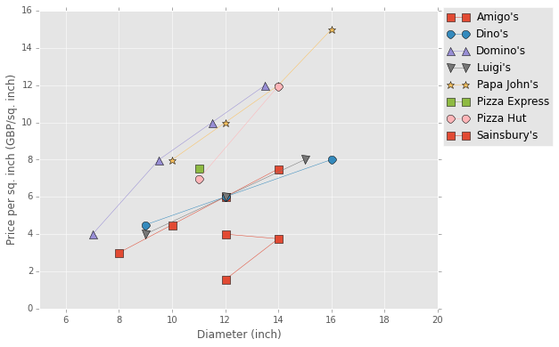 |
|---|
| ggplot for python - style |