Plot Data On A Map With QGIS
How To Plot Data On A Map With QGIS
One of the most useful things you can do with a GIS software package like QGIS is plot numerical data on a map. This post shows you how to plot data on a map with QGIS. I’ll be using the GBR_adm shapefile for the United United Kingdom, but the method should be applicable to pretty much any shape file.
Download files used in this example [zip]
Download the GBR_adm shapefile
Load Shape File Into QGIS
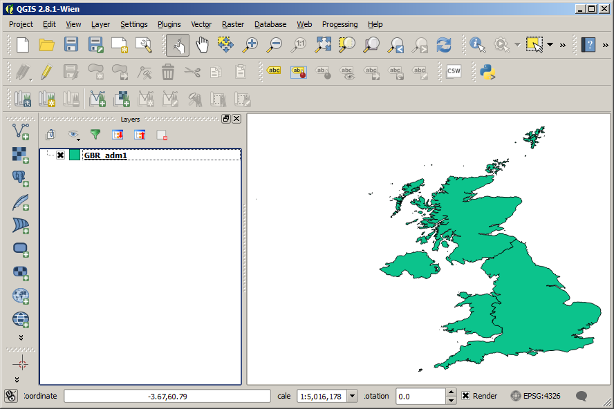
The GBR_adm bundle actually comes with shape files for different administrative levels: UK-wide, countries, and counties. To keep things simple, I’m going to be using GBR_adm1, which represents country-level boundaries.
Download the GBR_adm shapefile
The simplest way to load your shape file into QGIS is to just drag and drop it onto the QGIS window. Drag and drop either the .shp file or the .dbf file into QGIS. This will add it as a new layer into your project. When you first load the shapefile into QGIS, it should look something like this:
 |
|---|
| Plot Data On A Map - initial load |
Create a Data File To Plot
Having loaded in the shape file with the boundaries we are interested in, we now need to prepare our data for plotting. Of course, you may often already have data ready to plot, but in this example we will generate our own data. First we need to check what the names of the different boundaries in our shape file are. The easiest way to do this is probably to load the .dbf file into Excel, LibreOffice Calc, or similar. In our case the relevant column is “NAME_1,C,75”, which contains the country names. Copy this column into a Excel/Calc file. Create a second column to contain the data to be plotted. This could be real data you have for your different regions, but in this case we can just come up with some numbers to place in the column. Save this file as a .dbf file. Drag and drop this file into QGIS. This time it won’t display a new layer for it, but you will be able to see the file in the the layers panel.
Download files used in this example [zip]
Join The Shapefile to the Data
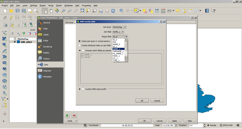
We now have two ‘layers’ in QGIS: one with boundaries representing the borders of the countries of the UK, and another with data relating to each of the different countries. The next step is to join those two layers together, so we can use the values stored in the data file, to colour the polygons in the shapefile. First, Right Click on the shapefile layer, go to properties and select ‘Joins’ on the left-hand bar. Click the + symbol to add a new join. Select your dbf file as the Join Layer and set the Join Field to the name of the column storing the shape-file labels in your .dbf spreadsheet. The Target Field should be the appropriate column in your shapefile database, e.g. NAME_1 in this example.
 |
|---|
| Set The Plot Colour Based on Data Value |
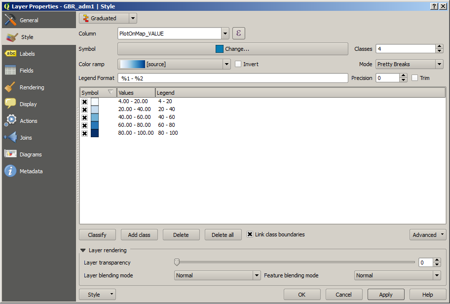
Our data file and our map shapefile are now joined. We now need to tell the shapefile layer to use that data to determine the colours of the map. To do this go to the style tab of the shapefile layer properties dialogue. Select ‘Graduated’ from the top drop-down menu. Select the column you want to use to determine the layer style, in this case ‘PlotOnMap_VALUE’. The rest of the options are pretty self-explanatory. Have a play around with them to see what you get.
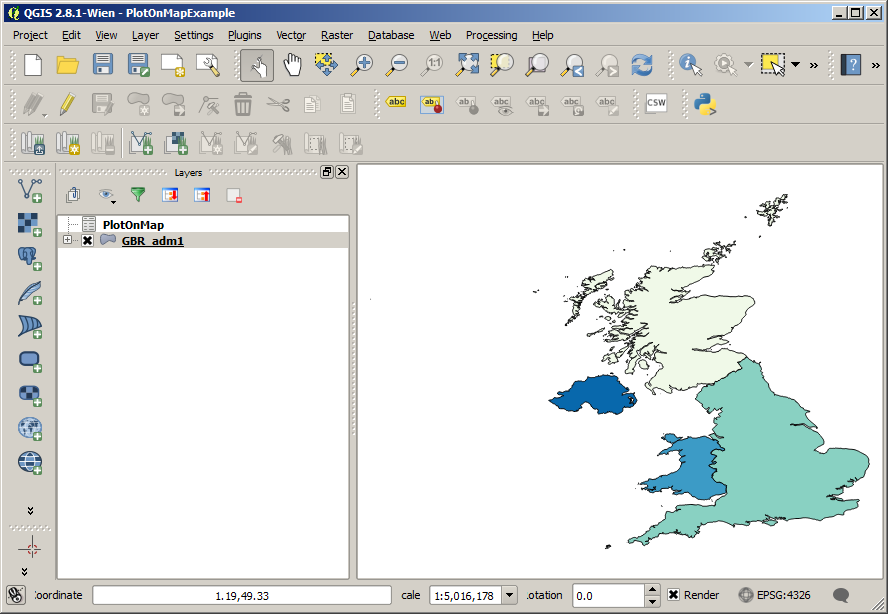
Once you’ve selected your style, click ‘OK’, and you should have a new map that looks something like this:
 |
|---|
| Layer properties style |
Once you’ve got this simple example working, see if you can do the same with the county-level boundaries of GBR_adm2.
 |
|---|
| Plot Data On A Map - end image |