The ROC Curve
The ROC Curve is a commonly used method for and evaluating the performance of classification models. ROC curves use a combination the false positive rate (i.e. occurrences that were predicted positive, but actually negative) and true positive rate (i.e. occurrences that were correctly predicted) to build up a summary picture of the classification performance. ROC curves are widely used because they are relatively simple to understand and capture more than one aspect of the classification.
The Receiver Operating Characteristic
The ‘ROC’ in ROC curve is an acronym for Receiver Operating Characteristic. This rather unwieldy term originates in the early days of radar, when operators were struggling to distinguish enemy aircraft from flocks of birds and other anomalies.
Radar engineers developed the ‘receiver operating characteristic’ to help determine correct radar settings to minimise the number of false positives from noise, while keeping the number of true positives from enemy aircraft high. The receiver operating characteristic has since become a commonplace metric for assessing other apparatus, medical tests and machine learning algorithms.
Each time the radar engineers tuned the settings, they could point their radar at some birds or planes, and find the the proportion of true positives and the proportion of false positives. High true positive rate, and low false positive rate are generally what is desired.
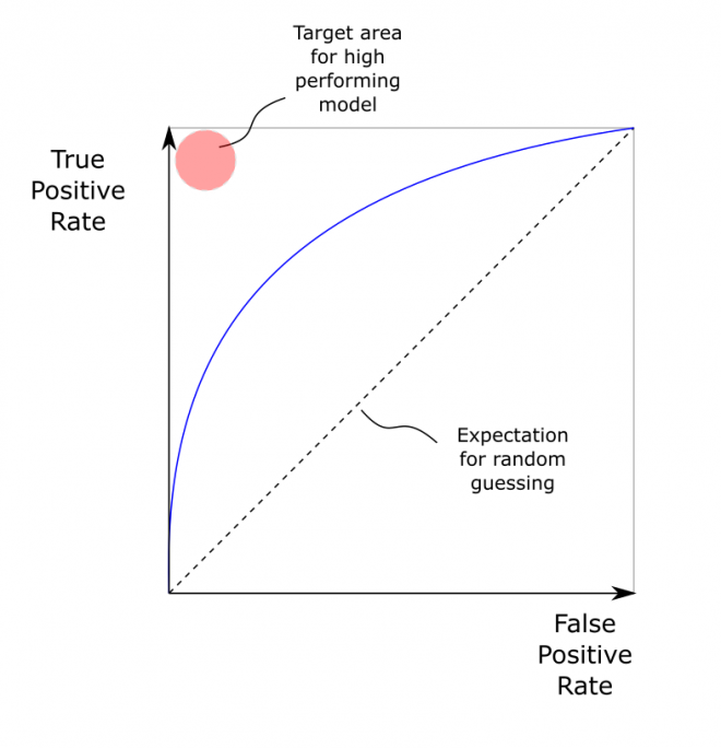
The ROC Curve
The ROC Curve is a plot of the true positive rate against the false positive rate across a range of detector or classifier setting.
- A good ROC curve - hugs top left corner: high true positive rate, low false positive rate.
- A bad ROC curve - runs along diagonal: true positive rate equals the false positive rate
The ROC Curve is typically generated by scanning a parameter, such as a sensitivity or threshold setting. This scanning over a range is a benefit over using a single metric (such as accuracy) is that it scans range of classification thresholds - not just a single one. The ROC curve makes it clear that there is a trade off between false positive rates and true positive rates.
 |
|---|
| Basic RoC curve |
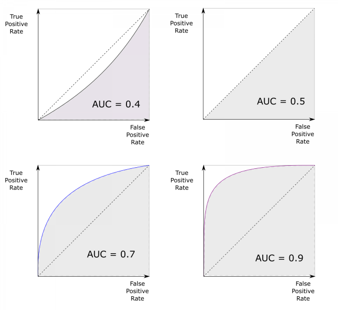
The Area Under The ROC Curve
The ROC Curve is good for looking at the performance of a single classifier, but it is less suited to comparing the performance of different classifiers. In other words, how do you decide which is the ‘best’ curve? A common solution to this is to use the area under the curve (AUC) to describe the curve with a single number. This way the ROC performance of a number of different classifiers can be readily compared. The area under the ROC curve allows different classifiers or tests to be compared. AUC of 0.5 = random guessing. AUC = 1 is perfect classifier.
‘Real world’ classifiers will typically have an AUC between 0.5 and 1, although it is also possible for a classifier to be worse than random, in which case the AUC value is less than 0.5. This is often an indicator that there is an error in how the test is working).
 |
|---|
| Some illustrations of possible ROC curves. An AUC greater than 0.5 is better than a random classifier. A perfect classifier would have an AUC of 1. |